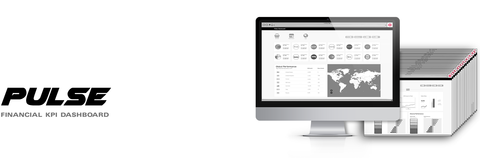
I helped design a financial dashboard for an international Consumer Packaged Goods (CPG) corporation. The web app, branded as the "Pulse Scorecard", will provide up to date financial metrics and KPIs for the parent corporation along with its subsidiary brands and customers.
My Role
I worked with my client’s financial and development team to structure the dashboard’s UI. Through collaborative iteration we were able to map out a feasible app architecture that displayed all of the required metrics.
Site Mapping • Wireframing • Prototyping
Information Architecture • Visual Design
The Challenge
This product will be a valuable tool for those interested in ultra specific facets of the corporation's financial performance from top to bottom. The dashboard will deliver complex filters that allow the user to access a wide variety of niche data points and run them vs. different time intervals and geographic locations.
Since it delves into advanced metrics beyond my understanding, it was important to work closely with the financial team in order to accurately display the data we were communicating.
The Framework
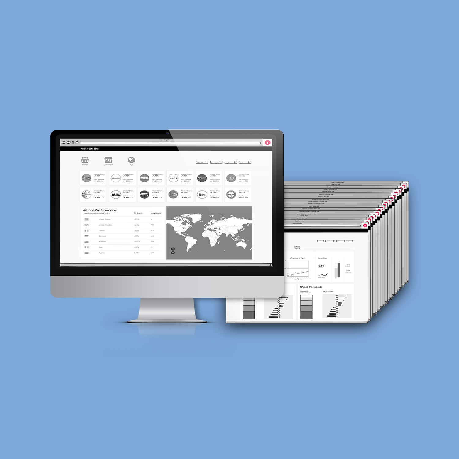
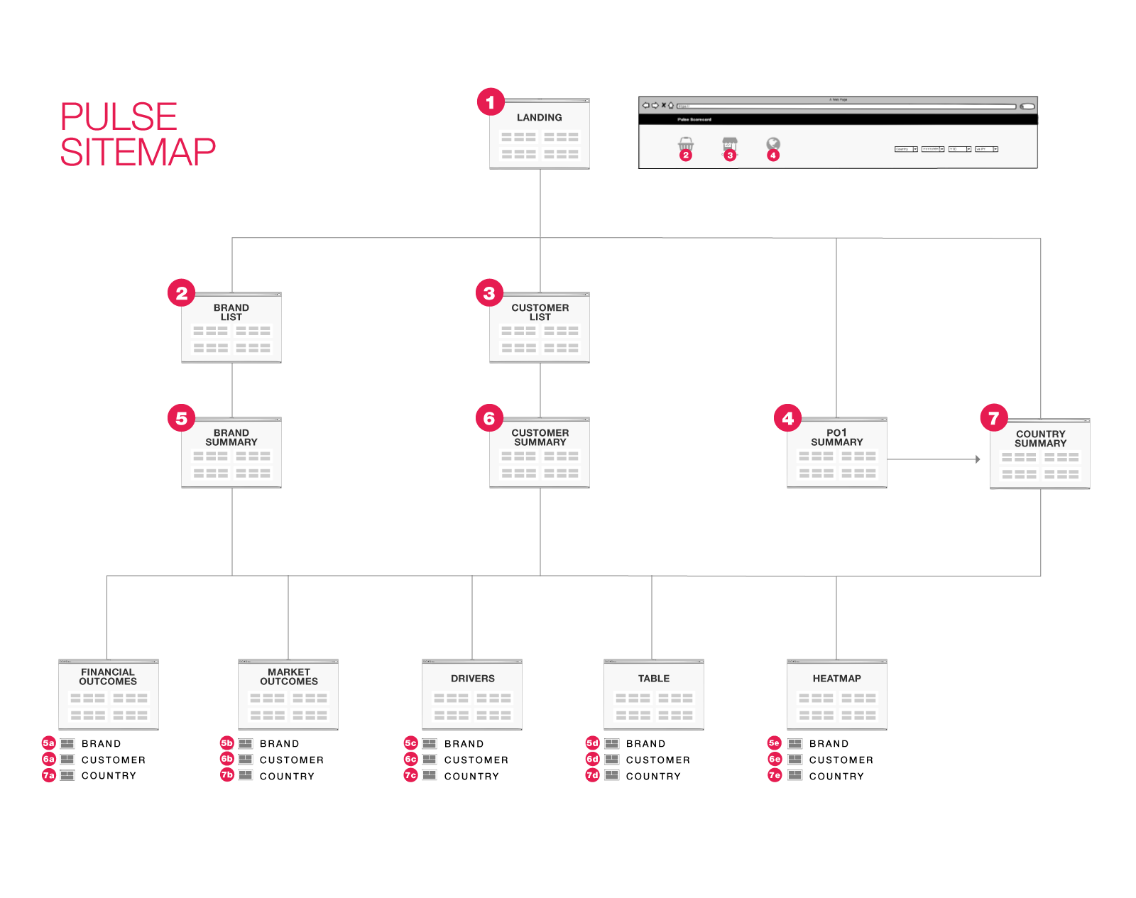
We determined that there would be three primary focuses of the dashboard—the CPG Brands falling under the parent company’s umbrella, the retail Customers providing distribution, and the varying national markets, which my client dubbed as PO1.
From here I was able to create a site map to visualize the paths of our various users.
I then began workshopping the interface via Balsamiq, which is a wireframing app specifically focused on churning out low-fidelity screens to explore and refine the structure of the product.
The Execution
After some iteration, we finalized a series of wireframes that successfully communicated how the dashboard would be structured. I then created a clickable prototype in Figma to demonstrate a bare-bones version of the dashboard.
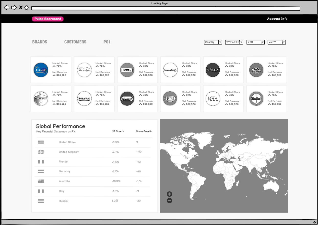
The landing page serves as a general summary of key brand and country performances. Users will be able to click any specific brand or country to drill into that specific entity’s full performance metrics.
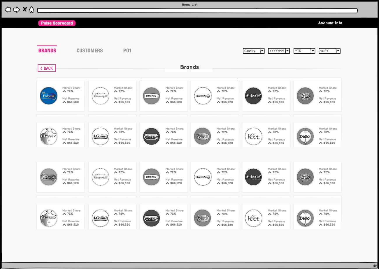
The main navigation consists of Brands, Customers, and PO1, each of which leads to a list of clickable items in the respective category. The user then selects which entity they are inquiring about to arrive at its comprehensive page.
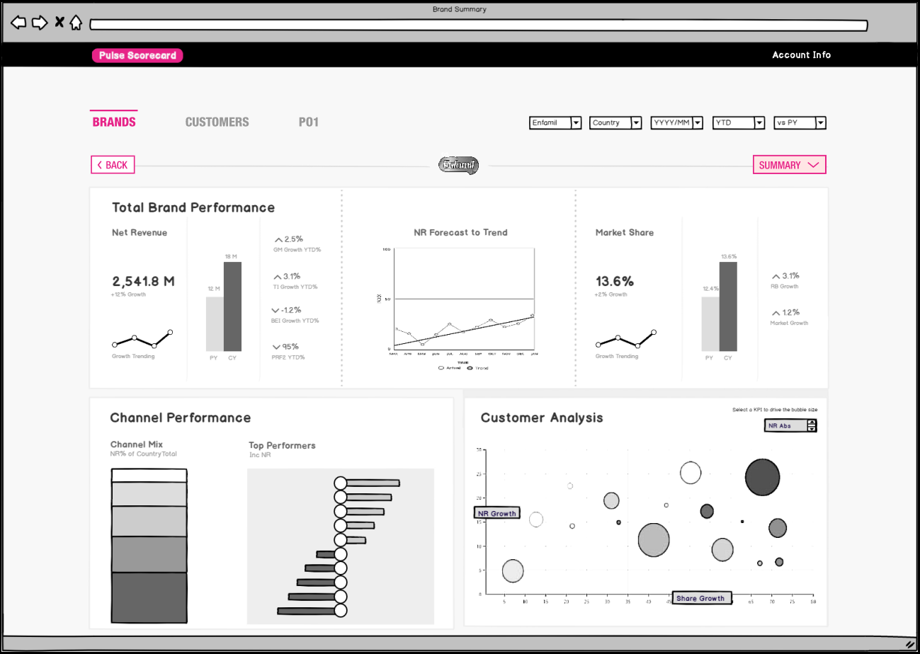
At the desired page, the user is given a general summary of the most relevant metrics. They can also drop down to four subsections labeled Financial, Market, Drivers, Table, and Heatmap.
The site-wide filters can be adjusted at any given point to rearrange the displayed data according to dates, locations, and other relevant variables.
The embedded prototype below provides a clickable demo. You can adjust your screen size options in the top right, or you can Click Here to open the prototype in a new tab.
When clicking the prototype, Figma provides a blue highlight over the actionable items. I chose to simulate someone looking for data about the brand Enfamil as the example use-case.
Email Mockup
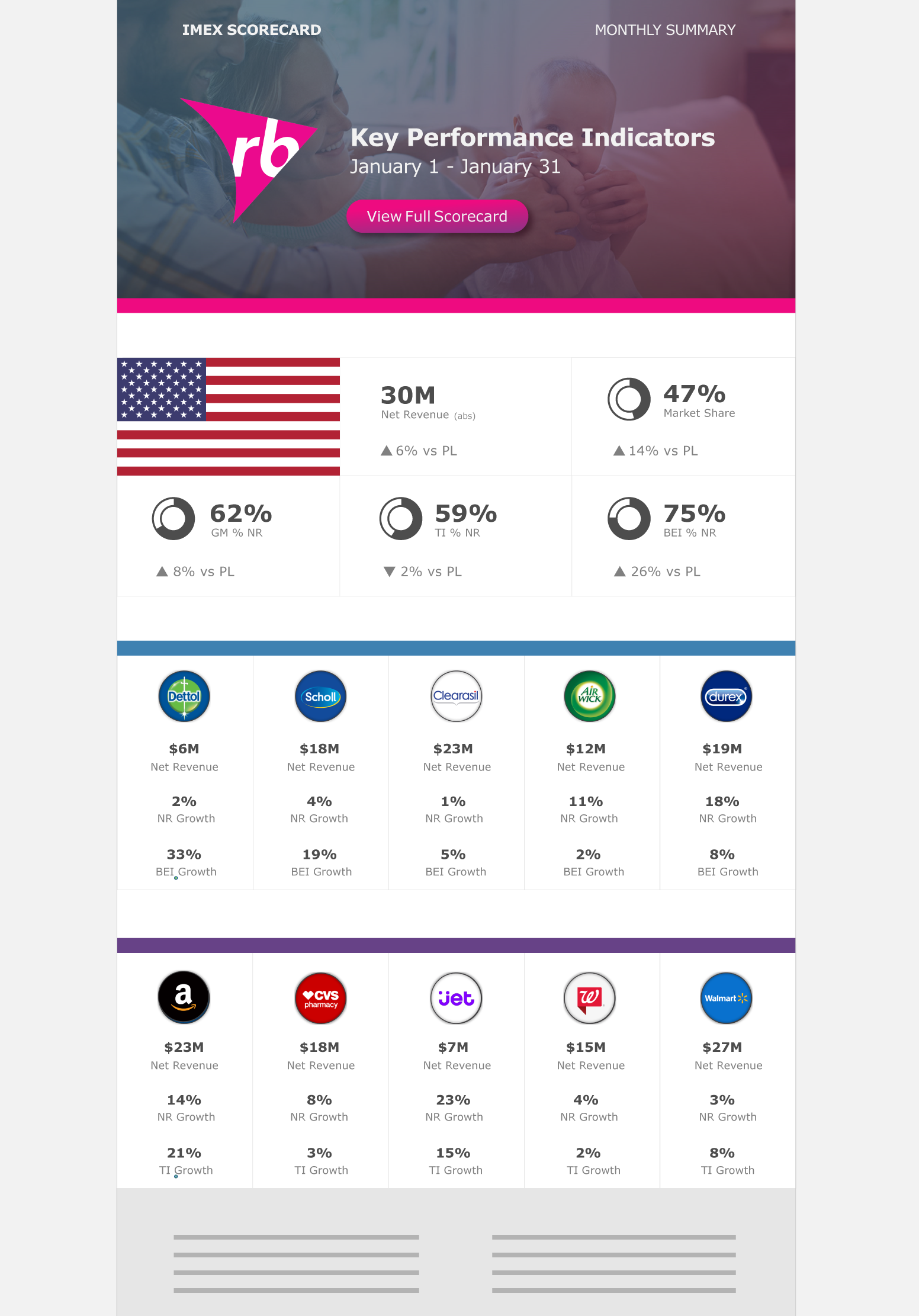
Along with the actual dashboard, I was asked to mock-up a potential email template. These periodical emails would aggregate key metrics from the Pulse Scorecard and send them out to the relevant parties in the form of a monthly financial summary.
The email would provide the primary data of the relevant country, along with its largest brands and customers.
The final section would include any relevant notes or points of emphasis moving forward.